Users are nowadays using mobile devices as their main means of accessing the internet. Consequently, any organization that needs to make sure the experience for the user is simple will ensure that the website has gone through a mobile friendly test. This will tell developers and testers where the improvements can be made because it will show how a website will perform on mobile devices.
This article describes the best practices for converting sites into mobile-friendly sites and the importance of testing as part of the development process.
Understanding Mobile-Friendliness
A mobile-friendly website is effective on smaller screens such as smartphones and tablets. The classical website will look distorted or difficult to navigate for mobile devices. A mobile-friendly site adjusts its layout and content so that reading text, clicking on buttons, and moving around are not slowed by delays and frustration.
Key Features of Mobile-Friendly Websites
The following are the important characteristics of a mobile-friendly website:
- Fast Loading Times
Pages must load fast to avoid losing users due to lags. Ideally, three seconds would be the perfect time in which pages would load, as research has shown that one-second delays cause massive bouncing rates. Optimizing images and minimizing code is an example of how it can be achieved.
- Readable Text
The font sizes should be big enough that one can read without having to zoom. A minimum of 16 points of body text is recommended to increase readability on smaller screens. Also, the use of high-contrast colors between text and background increases the usability and interaction of users.
- Accessible Navigation
Visibility of menus and buttons must be excellent on touch screens. Reducing navigation complexity by using collapsible menus or clearly labeled icons will help avoid extensive scrolling or searching.
- Optimized Images
These images should be resized to fit on mobile screens without losing any quality. This means using forms that balance image quality and file size for images to load fast enough while appearing sharp on a high-resolution display. Optimized images improve the overall UX, which contributes to faster loading time.
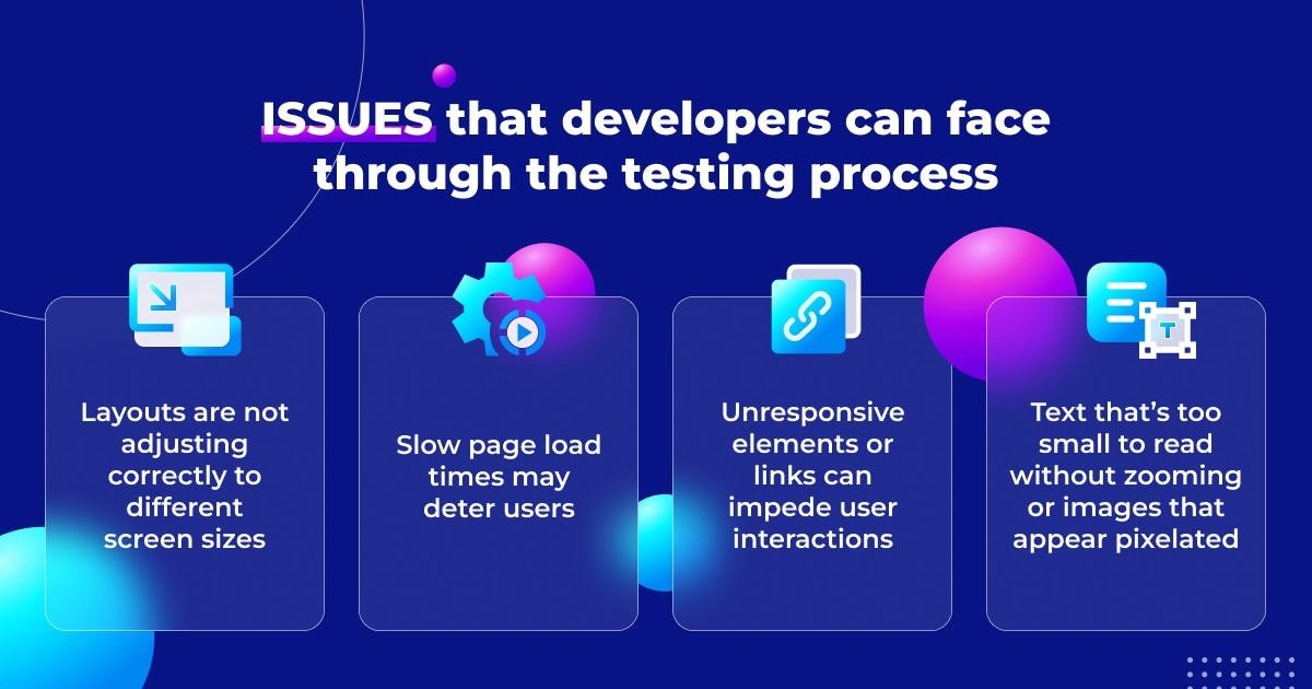
The Importance of Mobile-Friendly Testing
The testing of the website is required to meet the requirements for becoming mobile-friendly. It means such a test will put a device through speed, usability tests, and so forth, and general performance among various other devices.
It is so important that mobile users want an easy experience in viewing sites on their smartphones and tablets. Frequent testing allows organizations to determine problems that may cause difficulties for users, such as slow loading times and layout problems that do not work properly across different screen sizes. If a site looks broken or is too hard to scroll through, users will likely go to a competitor’s site.
Mobile-friendly testing also gives insights into the user’s behavior and preferences so that organizations can make good decisions about improving design and functionality. With mobile devices dominating internet use, accounting for more than half of all web traffic, neglecting mobile-friendly testing can have significant consequences.
Websites that don’t conform to mobile usability standards lose their visibility in search results since search engines like Google prioritize mobile-friendly sites while ranking. Lastly, testing websites regularly to ensure that they are mobile-friendly is a great way to ensure the proper working of a website across different devices, hence guaranteeing maximum user satisfaction and organizational outcomes.
Benefits of Mobile-Friendly Testing
The following are the benefits of mobile-friendly testing:
- Improved User Experience
A well-tested site provides a better experience for users, leading to higher engagement and retention.
- Better Search Rankings
Google favors mobile-friendly sites in search results, improving visibility and driving more traffic.
- Increased Conversion Rates
Users are more likely to complete actions like purchasing on a site that functions well on their device.
- Lower Bounce Rates
An excellent UX keeps visitors on your site for longer and doesn’t force them to bounce off in frustration.
Best Practices for Mobile-Friendly Websites
To design an effective mobile-friendly website, consider the following best practices:
- Responsive Design
Responsive design will automatically adjust the layout according to devices, so if accessed by smartphone or tablet users, there is a guarantee that the experience is uniform with your website.
Using CSS media queries, developers can make dynamic changes in styles and layouts so that images, text, and other elements resize accordingly. This adaptability not only enhances UX but also improves Search Engine Optimization (SEO), as Google favors mobile-friendly sites in its rankings.
- Optimize Loading Speed
Mobile users expect fast-loading pages. Target a load time of less than three seconds to decrease bounce rates. Compress images using tools like TinyPNG or ImageOptim to reduce the file size without any loss of quality.
Also, minimize code by removing unnecessary characters or comments and use browser caching to store frequently accessed files. Using Content Delivery Networks (CDNs) can also improve your performance by delivering content closer to your users, thus they deliver it faster.
- Reduce Navigation
Navigation of a mobile screen is extremely limited, so simplify the navigation menu. Use collapsible menus or icons for compact display and easy accessibility to reduce scrolling and clicking.
Don’t make visitors navigate far into your site to get access to critical information. Prioritizing easy navigation can ward off frustration and drive customers further to your site.
- Ensure Readable Text
A minimum of 16 points should be allowed for the font size so that it can be read without zooming, use high contrast between the text and the background in color, and avoid super fancy fonts as they take much more time to print and make reading difficult if printed on small screens.
- Improve Forms
Ensure forms are brief and simple, including only necessary information. Wherever possible, use types of input that facilitate the ease of data entry for the user, such as drop-downs or date pickers, and use auto-fill wherever possible to avoid forcing users to fill it in. A simple form experience can make a dramatic difference in mobile conversion rates.
- Test Across Devices
Cross-testing on multiple devices will determine the compatibility issues. Cross-testing is performed using cross-testing tools like Google’s Mobile-Friendly Test on various screen sizes and resolutions. Other similar platforms used for cross-testing are, for example, LambdaTest, a cloud-based testing platform. Testing from time to time ensures that your website runs pretty efficiently on a vast array of devices that go from smartphones to tablets.
- Monitor User Feedback
Collect feedback from users regarding their experience on your site through surveys or forms to get the feedback that can be used while choosing areas for improvement that guide future updates. Your understanding of user needs is integral while adapting your site and listening to feedback from a user.
- Integration With Touch-Friendly Components
Make sure buttons and links are large enough to tap easily with fingers rather than being clicked precisely with a mouse cursor. A minimum of 44×44 pixels is recommended for touch targets to make it easier for the user to navigate without frustration.
- Avoid Flash Content
Flash is not supported by many mobile devices. Do not use it in your design. Use HTML5 for animations and interactive content, which will work fine on all platforms. This switch improves compatibility and gives the user a seamless experience.
- Update Your Site Regularly
Technology is changing fast, and so are the expectations of the user. A regularly updated website keeps it relevant and serves the needs of its targeted audience. Fresh content along with new features can be really helpful in keeping users on board for a long period.
The Role of Cloud Testing in Mobile Friendliness
Cloud testing has revolutionized the method of software testing, especially for mobile applications and websites. Developers, through cloud-based platforms like LambdaTest, can do massive tests without having a device. Teams can put much emphasis on improving their application without forgetting that it should perform well in many environments.
One of the major advantages of cloud testing is the availability of various devices. Organizations can test their sites on thousands of real devices without owning them. This access ensures that applications are evaluated in real-world scenarios, which results in more accurate results.
Another significant advantage is cost efficiency. Cloud testing reduces the costs associated with maintaining physical hardware. Organizations no longer need to invest in a wide array of devices or deal with the ongoing maintenance costs that come with them.
Scalability is also a key benefit of cloud testing. Teams can easily scale their testing efforts based on project needs without significant investment in infrastructure. This flexibility allows organizations to adapt quickly to changing requirements or increased workloads.
Cloud testing also boosts collaboration. Teams can sit anywhere and collaborate in real-time. This allows quicker sharing of findings and speedy implementation of changes. Today, especially with the way people are working remotely, it will be useful to have such an ability.
In addition to these benefits, a responsive checker in the cloud testing platforms ensures applications not only work correctly but also deliver the best experience on various devices. Organizations can then streamline the testing process and improve overall efficiency when such tools are integrated.
Overall, cloud testing represents a contemporary approach to mobile application development. It enables organizations to deliver quality products at reduced costs while maximizing collaboration.
Tools for Mobile-Friendly Testing
There are several tools available for testing mobile-friendliness:
- LambdaTest
LambdaTest is an all-in-one platform. It enables you to run tests across more than 3000 real desktop and mobile environments. This guarantees your site is compatible with a wide range of browsers and devices.
LambdaTest is the most reliable platform for organizations looking to enhance their testing capabilities. With its cloud-based infrastructure, it provides super-fast access to diverse testing environments, which can lead to quicker release cycles and faster developer feedback.
It supports automated testing frameworks such as Selenium, Appium, and Cypress, making it easier for teams to combine testing in their development workflows. Features of the platform include real-time debugging and screenshot testing to quickly find issues.
- Google’s Mobile-Friendly Test
Google’s mobile-friendly test was a simple tool for finding out whether a page works on mobile devices or not. It can tell by entering a URL whether the site meets Google’s usability standards for mobile phones or not.
The insights show specific issues that would prevent users from getting optimal viewing experiences, such as font size, viewport settings, or enough space between links. This makes for great feedback for developers who want their site to be optimized for users on mobile devices. Now this is retired by Google.
- Bing’s Mobile Friendliness Test
Like Google’s tool, Bing’s Mobile Friendliness Test provides different insights related to how Bing perceives your site. It reviews the mobile-friendliness of a webpage and offers ideas for improvement.
This one is very helpful for institutions that want to make certain their site performs well within multiple search engines, thus allowing people to reach a wider audience.
Conclusion
To conclude, ensuring a mobile-friendly website will not be too much of an ask in this digitalized world where people mainly seek access to information through a smartphone or a tablet. Implementing the best practices of providing responsive design, optimized loading time, simplified navigation, readable texts, optimized forms, extreme testing on all types of devices, and feedback from end-users can allow organizations to maintain an engaging UX for any target audience.
Moreover, using LambdaTest can significantly improve the testing process by accessing real desktop and mobile environments across a wide range of different browsers and devices. It helps organizations achieve compatibility efficiently with high-performance standards.
Finally, embracing these strategies will lead organizations toward better visibility in search results and improve user satisfaction, components of driving success in an increasingly competitive online landscape.
By prioritizing mobile-friendliness through continuous testing and optimization efforts with platforms like LambdaTest, organizations will not only meet UX but also foster loyalty among their audience, which is a crucial factor in a fast-paced digital world where competition is fierce and attention spans are short.